Roller banner design at a glance: 10 rules
A roller banner usually stands in an aisle, by an entrance or behind a stand, competing with everything else around it. Passers-by give it a few seconds, so the design has to work like a road sign, not like a leaflet. Here are the 10 rules we expand on below.
- 1. One goal — the banner says one thing to one audience.
- 2. A short headline — ideally up to 7 words, understood in 3 seconds.
- 3. Logo and headline at the top — visible above people's heads.
- 4. A quiet bottom — background only in the lowest 30–40 cm.
- 5. Large lettering — sized for the viewing distance.
- 6. A simple typeface — sans serif, no more than two typefaces per design.
- 7. Strong contrast — dark text on a light background or the reverse.
- 8. One strong image — instead of a collage of small pictures.
- 9. One call to action — a web address, a QR code or a phone number, not all at once.
- 10. Design for the location — a reception, a stand and a stage need different things.
The message: one idea and a short headline (rules 1–2)
Rule 1. One banner, one goal
Before you open any design software, finish this sentence: "After seeing the banner, the visitor should…". Remember the brand, book a demo, scan a discount code or find the right room. If you have several goals, consider two banners with separate messages instead of one overloaded design. A consistent series works better than a single graphic that tries to say everything.
Rule 2. A headline of up to 7 words
The headline should describe a benefit for the reader, not praise the company. "Online bookkeeping with no office visits" says more than "A leader in innovative solutions". Arrange the content in a clear hierarchy: logo, headline, two or three benefits and a call to action. Remove everything else or move it to a leaflet you hand out next to the banner.
A quick test: show the design to someone for 3 seconds and ask what they remember. If they cannot repeat the headline, shorten it or make it bigger.
Layout: the height zones of a pull up banner (rules 3–4)
A roller banner has about 200 cm of visible height, and models with a telescopic pole reach 220 cm. Not every part is equally visible. An adult's eyes are roughly 150–170 cm above the floor, and in a crowd the lower half of the graphic is hidden by people and furniture.
| Zone (from the floor) | What to place there | Why |
|---|---|---|
| 150–200 cm | logo, main headline | visible above heads, from a distance and from the aisle |
| 90–150 cm | benefits, product photo, QR code | eye and hand height for someone who has stepped closer |
| 30–90 cm | continuation of the photo, web address | often blocked by people, counters or chairs |
| 0–30 cm above the base | background only | looked at least and easy to miss |
Rule 3. Logo and headline at the top
Place the logo in the upper part of the graphic, a few centimetres clear of the top rail. Put the headline directly below or beside it so both can be read in a single glance. On 220 cm banners such as the Wave roller banner or the Clip roller banner, the top zone sits higher, so the message is easier to see over a crowd.
Rule 4. Nothing important near the floor
Treat the lowest 30–40 cm as a background zone. Do not put the logo, phone number or QR code there, because nobody is going to crouch down to scan it. Remember too that part of the graphic disappears into the base. Graphic size, bleed and safe area are covered in our guide to roller banner artwork set-up.
Typography: letter size and typeface (rules 5–6)
Rule 5. Lettering sized for the distance
As a rule of thumb, a capital letter 1 cm tall can be read from about 1 m, but for comfortable reading on the move allow closer to 2 cm per metre of distance. On a banner meant to pull people in from the aisle, that gives these values:
| Element | Capital letter height | Readable from |
|---|---|---|
| Main headline | 8–15 cm | about 5–10 m |
| Subheading, benefits | 4–6 cm | about 3–5 m |
| Web address, phone | 3–5 cm | about 2–4 m |
| Supporting text | at least 2 cm | about 1.5–2 m |
Rule 6. A simple typeface, no more than two per design
- Sans serif — a clear typeface in medium, semibold or bold weight is the easiest to read from a distance.
- No light weights — light and thin styles vanish against a photo and from further away.
- Capitals for short headlines only — longer text set entirely in capitals is slower to read.
- Left or centre alignment — avoid justified text, which opens gaps between words.
- Spacing — line spacing of about 120–130% of the type size and clear gaps between blocks of content.
Colour and contrast (rule 7)
From several metres away, contrast matters more than letter size. Dark text on a light background, or light text on a dark, plain background, works best. If text sits on a photo, place it over a calm area of the image or add a semi-transparent colour band behind it.
- Greyscale test — convert the design to black and white. If the headline merges with the background, the contrast is too weak, however good the colours look.
- Risky colour pairs — red on green or blue on red strains the eye and is hard to read for people with colour vision deficiency.
- Brand colours in CMYK — check how they look after conversion, as vivid screen colours lose saturation in print. Read more in our guide to CMYK, RGB and Pantone in print.
- Base colour — a black base, available for example on the Exclusive roller banner, suits dark interiors and bold graphics, while silver suits bright, modern spaces.
Photos and graphics (rule 8)
One large, clear photo grabs attention better than a collage of six small ones. Show the product, the result of the service or a person using it, and give it plenty of space. Fine detail, charts and tables cannot be read from several metres away.
- Resolution — photos at full size should have 100–150 ppi. See our guide to large-format print resolution for details.
- Portrait crops — a roller banner is tall and narrow, so a landscape photo has to be cropped hard. Choose shots that can take it.
- Background to the edge — run the photo or background colour into the bleed so the graphic has no accidental borders.
- Icons instead of paragraphs — three icons with one-word captions communicate benefits faster than text.
Contact details, QR codes and the call to action (rule 9)
Every banner should tell people what to do next, in a single line. Choose one main call to action: "Scan for the catalogue", "Ask for a demo at the stand" or "See the offer online". Full addresses, company numbers, opening hours and lists of branches belong on a leaflet.
- Web address — short, without unnecessary prefixes, with letters at least 3 cm tall.
- QR code — at least one tenth of the scanning distance, so about 15 cm for 1.5 m, placed 100–150 cm above the floor. Check that it opens a page that works well on a phone.
- Phone number — only if someone really answers enquiries from the event on it.
- Social media — one profile rather than a row of icons.
Designing for the location and for a series (rule 10)
The same design looks different in a reception, on an exhibition stand and on a stage. Before you start, find out where the banner will stand and what will be next to it.
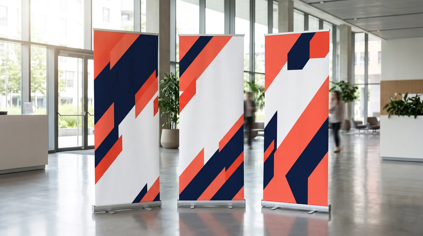
- A series of banners — if two or three stand side by side, plan a shared line for logos and headlines, or a panoramic photo across them. For example, several Premium roller banners at 120 or 150 cm wide create a consistent stand backdrop.
- Behind a speaker — place the logo higher than the speaker's head, because in photos and video the person hides the lower part of the graphic. The Pro roller banner, also available at 200 × 200 cm, suits this job, and for a backdrop several metres wide a display wall is the better choice.
- Surrounding colours — against white exhibition walls a dark or saturated graphic stands out, while a calmer design suits a bright, minimalist interior.
- Scale test — an A4 print is about one seventh of the banner's height. Looking at the sheet from about 75 cm shows you what a passer-by sees from 5 m.
Ordering a roller banner and its graphic
Start the design by choosing the model, because the graphic size depends on the stand. Our roller banner range covers widths from 80 to 200 cm and heights of 200 and 220 cm. The Standard roller banner starts from €26.98 incl. VAT, and the telescopic Wave roller banner with its graphic swap system starts from €76.70 incl. VAT. If you are torn between models, read our guide on which roller banner to choose.
Standard roller banner – pull up stand 85–150 cm
from €26.98 incl. VAT6 versions
In stock — ships in 1–2 business days
- Deal of the week
Premium roller banner – pull up stand 80–150 cm
from €37.06€52.36incl. VATLowest price in the 30 days before the discount: €52.365 versions
In stock — ships in 1–2 business days
Exclusive roller banner – pull up stand 85–200 cm
from €71.40 incl. VAT10 versions
In stock — ships in 1–2 business days
Wave roller banner – telescopic pole, graphic swap
from €76.70 incl. VAT4 versions
In stock — ships in 1–2 business days
You can ask us about printing the graphic in a quote request or have it printed by any print shop. Every product page lists the graphic size. For a series of banners for branches, retail chains or agency clients, send a quote request and we will prepare a quote with B2B prices.
Frequently asked questions
How do I design a roller banner step by step?
Start with the goal and a single headline, then choose the model and check the graphic size on the product page. Set up the document at 1:1 with bleed, put the logo and headline at the top, benefits and the QR code at 90–150 cm, and fill the bottom with background. Check contrast in greyscale, print the design on A4 and view it from about 75 cm, then export a print-ready PDF.
How much text should a pull up banner have?
Less than you think. A headline of up to 7 words, two or three short benefits and one call to action work well, usually between a dozen and a few dozen words in total. Passers-by give a banner only a few seconds, so longer text is read only by people who have already stepped closer. Move offer details, price lists and branch addresses to a leaflet or to the page the QR code opens.
How big should the lettering be on a roller banner?
Design the main headline with capital letters 8–15 cm tall, benefits at 4–6 cm and the web address at least 3 cm. The smallest text should not drop below roughly 2 cm capital height. As a rule of thumb, each centimetre of letter height gives legibility from about 1 m, but for comfortable reading on the move it is better to allow 2 cm per metre.
Where should the logo go on a roller banner?
Put the logo in the upper part of the graphic, in the zone about 150–200 cm above the floor, a few centimetres clear of the top rail. There it can be seen above people's heads, from the aisle and in photos. Do not place the logo at the bottom of the banner, because people, counters and chairs block that zone and part of the graphic sits inside the base.
Which software should I use to design a roller banner?
Vector or layout software is the most convenient: Adobe Illustrator, InDesign, Affinity Designer or CorelDRAW. They let you work at 1:1, set bleed and export a print-ready PDF with outlined text. Photoshop is good for editing photos, but text is better added in a vector program. Canva is fine for simple designs if you set the size in centimetres and switch on the print bleed.