CMYK or RGB: the short answer
RGB describes colours of light: a screen mixes red, green and blue, and all three together make white. CMYK describes colours of ink: the printer lays cyan, magenta, yellow and black onto a white material, and each layer absorbs part of the light. That is why print files are prepared in CMYK, while RGB stays with websites, presentations and screens.
Large-format printing has one important exception. Some printers prefer an RGB file with an embedded profile, or a PDF/X-4, and convert it themselves to the profile of their own machine and the specific material. Before you convert anything, ask your printer what they expect.
| Feature | RGB | CMYK | Pantone |
|---|---|---|---|
| Principle | mixing light | layering inks | ready-made, numbered reference colours |
| Where it is used | screens, web, presentations | print, including roller banners and display walls | brand identity, printing with spot colours |
| Colour range | widest | narrower, especially for vivid greens and blues | includes colours outside CMYK |
| Notation | e.g. R0 G120 B200 or a HEX code | e.g. C100 M40 Y0 K0 | e.g. Pantone 286 C |
Why screen colours do not print the same
A monitor emits light, while a print only reflects the light around it. A screen can show neon green, electric blue or bright orange that CMYK inks simply cannot reproduce. After conversion those colours become darker or less saturated. This is not the printer's fault; it is a difference in colour range, known as gamut.
| Colour on screen | What happens in CMYK | What to do |
|---|---|---|
| Vivid green, lime | turns more olive | pick a green within the CMYK range and check it on a test print |
| Intense blue (R0 G0 B255) | darkens and drifts towards violet | use the CMYK values from your brand guidelines |
| Neon orange and red | loses its glow | do not plan on a fluorescent effect in CMYK print |
| Dark greys and blacks | merge together, shadow detail disappears | lighten shadows before converting |
Monitor settings add to the problem. An uncalibrated screen is often too bright and too blue, so do not judge brand colours on it. A test print viewed in bright, neutral light is the reliable reference.
Colour profiles: FOGRA39, FOGRA51 and your printer's profile
Saying "CMYK" is not enough. The same C, M, Y and K values printed on different machines and materials give different colours. That is why ICC profiles are used to describe specific printing conditions.
- Coated FOGRA39 (ISO Coated v2) — the most widely used CMYK profile in Europe and a safe choice when the printer has not specified another.
- PSO Coated v3 (FOGRA51) — the newer equivalent for coated papers, increasingly required for offset printing.
- Large-format printer profiles — wide-format machines have separate profiles for blockout, fabric, vinyl or backlit materials. If your printer shares its profile, use it for soft proofing.
- sRGB and Adobe RGB — profiles for RGB files. If you send RGB, the profile must be embedded in the file.
In Adobe applications, a good starting point for Europe is the Europe Prepress 3 colour settings preset, which uses Coated FOGRA39 as the default CMYK space. Apply it in every application you use so that Illustrator, InDesign and Photoshop all work with the same profiles.
Converting RGB to CMYK without surprises
- Keep an RGB copy of every photo. Conversion is lossy and cannot be reversed without losing colour.
- In Photoshop, turn on soft proofing with the target profile (Proof Colors, Ctrl+Y) and the out-of-gamut warning (Gamut Warning, Shift+Ctrl+Y). You will see which areas change most.
- Adjust the most problematic colours while still in RGB: reduce saturation slightly or shift the hue until the preview looks acceptable.
- Convert using Convert to Profile. Perceptual intent usually works better for photos, while relative colorimetric with black point compensation suits graphics with brand colours.
- Enter logo, text and background colours manually in CMYK from your brand guidelines rather than converting them automatically.
- Check blacks and total ink in the finished PDF, for example in Output Preview in Acrobat Pro.
Black, greys and total ink coverage
Black is where mistakes happen most easily. Pure RGB black converts automatically into a mix of all four inks with a very high total. On small text that can produce soft, coloured edges, and on a large background it can exceed the ink limit.
| Use | Example values | Notes |
|---|---|---|
| Small text, fine lines | C0 M0 Y0 K100 | sharp edges, no coloured fringes |
| Large black background | C60 M40 Y40 K100 | deep, rich black, 240% total |
| Cool black | C60 M0 Y0 K100 | slightly bluish, suits cool colour schemes |
| Warm black | C0 M60 Y30 K100 | slightly brownish, suits warm photography |
Total ink coverage (TAC) is the sum of the C, M, Y and K percentages in the darkest part of the graphic. Large-format printers usually state their own limit, often around 300%. Going over it slows drying and can cause runs on some materials. You can check the value in Output Preview in Acrobat Pro. Greys built from K alone are stable and free of colour casts, but always check large flat grey areas on a test print.
Pantone in large-format printing
Pantone is a system of numbered reference colours, such as Pantone 286 C. In offset printing a Pantone colour can be a separate, specially mixed ink. Large-format machines, however, print with a fixed ink set (CMYK, sometimes with extra colours), so a Pantone colour is reproduced as a mix of those inks. Many shades come out very close to the reference, but some, particularly intense oranges, greens and violets, may differ.
- Give the number and the suffix — C means the reference on coated paper, U on uncoated. Same number, different appearance.
- Keep CMYK values from your brand guidelines — guides such as Pantone Color Bridge show the nearest CMYK equivalent next to each reference colour.
- Remove stray spot colours — if the file contains Pantone colours your printer is not expecting, convert them to CMYK before export.
- Order a test print — for an important brand colour, ask for a proof on the same material as the full run and compare it with the swatch book.
The same colour on different materials
Colour depends not only on the file but also on the substrate and the lighting. The same file printed on blockout, fabric and a backlit material gives three slightly different results.
| Material | How colour looks | Watch out for |
|---|---|---|
| Blockout (roller banners) | even, matt or satin | use rich black on large dark backgrounds |
| Fabric (fabric walls, frames) | deep, with no glare | fine detail softens, shade depends on the fabric and print method |
| Backlit (lit from behind) | glowing, more saturated | tell the printer the graphic will be illuminated |
| Poster paper (frames, A-boards) | close to offset print | gloss or matt finish changes how colours read |
If a roller banner, a fabric wall and a light box stand side by side on your stand, order all the prints from one printer, in one order and with the same brand colour values. Differences between materials can never be removed completely, but they can be reduced a lot. Read more about substrates in our guide to large-format print materials.
Colour checklist before printing
- You know whether the printer wants CMYK with a specific profile or RGB with an embedded profile.
- Brand colours are entered in CMYK from the brand guidelines, with Pantone numbers given in the order notes.
- Vivid colours have been checked with soft proofing and adjusted.
- Small black text uses K100 only, and large black backgrounds use rich black.
- Total ink stays within the printer's limit.
- The file contains no unintended spot colours.
- The printer knows which material the job is for and whether it will be backlit.
- A test print has been ordered for any critical brand colour.
The rest of the file set-up, including bleed, safe area and PDF export, is covered in our guide to roller banner artwork, and matching resolution to viewing distance in large-format print resolution.
Materials and display systems: next steps
If you print in-house or run an agency, our print materials include 50 m rolls such as Blockout Premium 330 g for roller banners, backlit 180 g and backlit 270 g for illuminated graphics, and blackback 260 g with a black reverse layer. The displays you design for are in our roller banners and display walls. For example, the Standard roller banner starts from €26.98 incl. VAT.
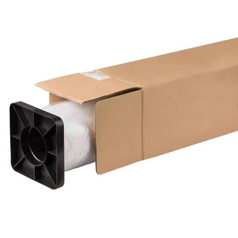
Blockout Premium 330g
from €120.69 incl. VAT4 versions
In stock — ships in 1–2 business days

Backlit Samba 180 g
from €191.97 incl. VAT2 versions
In stock — ships in 1–2 business days

Blackback 260 g width 3,2 m
€561.87 incl. VATIn stock — ships in 1–2 business days
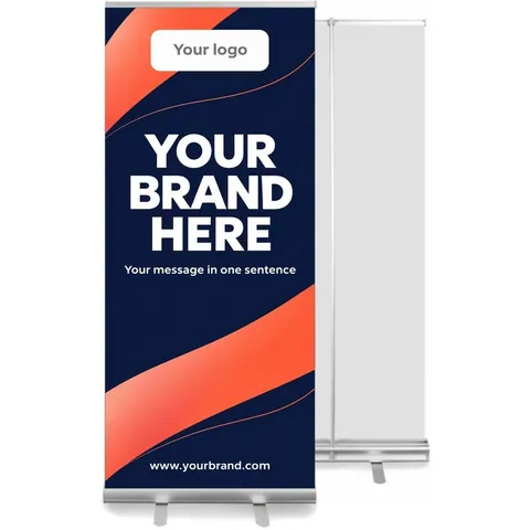
Standard roller banner – pull up stand 85–150 cm
from €26.98 incl. VAT6 versions
In stock — ships in 1–2 business days
You can ask us about printing the graphic in a quote request or have it printed by any print shop. Every product page lists the graphic size. For larger quantities of materials or displays for agency clients, send a quote request, and a business account shows you B2B prices.
Frequently asked questions
Does a print file have to be CMYK?
Usually yes, because printers use inks and a CMYK file shows what print can realistically achieve. Some large-format printers, however, accept RGB files with an embedded profile or PDF/X-4 and convert them to the profile of their own machine and material. Always ask your printer about their requirements. If they have not specified anything else, use CMYK with the Coated FOGRA39 profile.
Why does my print look darker than on screen?
A monitor emits its own light and is usually set brighter than colour-critical print work requires. A print only reflects the surrounding light, so in dim conditions it looks darker. On top of that, some RGB colours fall outside the CMYK range and lose saturation when converted. Calibrating your monitor, soft proofing with the printer's profile and ordering a test print all help.
How do I print a Pantone colour on a roller banner?
Give the printer the colour number with its C or U suffix, plus the CMYK equivalent from your brand guidelines. A large-format machine reproduces it as a mix of its inks, so many colours come out very close to the reference, but not all. For an important brand colour, ask for a test print on the same material that will go into the banner and compare it with a Pantone swatch book.
Which CMYK profile should I use for large-format printing?
Ask your printer first, because wide-format machines have profiles built for specific materials. If the printer has not given you a profile, Coated FOGRA39, also known as ISO Coated v2, is the safe choice in Europe. You will also see PSO Coated v3 (FOGRA51) more and more often. Above all, make sure every file in one order is prepared with the same profile.
What is rich black and when should I use it?
Rich black is black built from all four inks, such as C60 M40 Y40 K100, instead of K100 alone. Over large areas it looks deeper and more even, which is why it is used for dark backgrounds on roller banners and display walls. Do not use rich black for small text or fine lines, because the edges may look slightly soft and coloured. Keep those in pure K100.